I’ve reworked a couple of my first rough comps, and created some new ones.
I struggled with text treatment on some of these iterations, so I have included a couple of inspiration images that use text more like what I’ve envisioned for this project.
After selecting a layout to move forward with, I want to find the best font for that treatment, then experiment with text manipulation. I also want to hone my color palette, based on my final design choice, and to choose the best portrait to use.

This image incorporates a color scheme similar to palettes Rodchenko worked with, and uses rule of thirds composition. It includes text treatment and bars of color modeled after Rodchenko’s work.

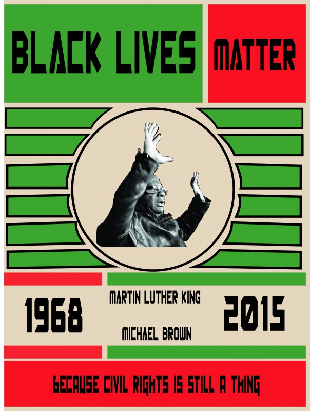
This image uses a color palette and text treatment modeled after Rodchenko’s work. I’ve modified his megaphone / sunburst design to draw attention to the portrait in the image, and evoke Rodchenko’s earlier work. Text treatment and rule of thirds is also used, after Rodchenko’s style.

This Rodchenko-inspired image uses a similar color palette and fonts to Rodchenko’s work. The angled text and lines evoke his megaphone from his famous “Books” poster. The blocks of color and font choices are also inspired by Rodchenko. However, I’ve added my own perspective to address a modern headline in this image.

This image is a reinterpretation of Rodchenko’s “Books” poster. It incorporates similar graphic elements, but modifies the portrait used. The color palette, font choices and rule of thirds composition mimic Rodchenko.

I would like to explore color and text treatment more in this iteration of my Rodchenko-inspired mockups. I envision the text looking different from what I have been able to do with it so far. The color scheme and blocks of color are inspired by Rodchenko. I’ve taken a portrait dropped into a circle with strong diagonal lines, representative of a megaphone and reinterpreted them to fit a modern theme.

This poster imitates Rodchenko’s penchant for opposite hand work, and rule of thirds composition. It echoes his blocks of color and uses similar font treatment. The image in a circle may evoke his earlier work that featured a woman shouting “Books.”
This mockup mimics Rodchenko’s use of repetition (think the bottles poster). It reinterprets the megaphone (shouting a message) seen in his “Books” poster. Fonts, color choices and rule of thirds composition also imitate Rodchenko.


You must be logged in to post a comment.