Texture
I’ve found a couple of examples of texture that represent both the “literal surface” and “optical appearance” of those surfaces. Texture is part of the message. A smooth, glossy appearance conveys a different message than a rough, jagged surface. As designers and communicators, it’s important that we consider how texture may affect the message we are trying to convey.
It’s interesting to note that texture is more meaningful when we have something to compare it to, like the book says, prickly vs. soft or fuzzy vs. smooth.
I was especially intrigued by the examples in the book that used text to create texture.
Color
I love the Chagall quote at the beginning of the section on color in our textbook: “All colors are the friends of their neighbors and the lovers of their opposites.”
Although I work frequently in black and white with my photography, I love playing with color in other artwork.
Like other design elements, color is evocative. It’s important to consider the impact of our color choices on readers and viewers. Available light and colors nearby can influence our perception of color.
Colors have relationships with other colors, some harmonious and others not so much. Color theory gives designers tools to help choose colors based on the message they want to convey. An analogous color scheme can create a peaceful mood, while complimentary color schemes create visual interest and tension.
The concept of optical mixing is fascinating, and it makes me think of a Monet painting, where the viewer’s eyes mix colors to produce an effect not seen when the work is viewed close-up.

This package illustrates how contrasting colors can call attention to a message. The secondary colors on this package are analogous to the bright green background, with accent splashes of a red-violet that is near to the violet used in the main text. This colorful display allows the message to be seen clearly, even within this flat design.

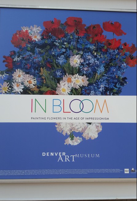
This images shows how color can be used to support the message. The colors from the flowers are replicated in the text, providing unity and reinforcing, well, color.
Gestalt
Because people tend to internally group like objects together to help them interpret their surroundings, designers can incorporate Gestalt principles into their work to help create a sense of completeness and unity.
Designers can use the Gestalt principles of —
- Simplicity
- Similarity
- Proximity
- Closure
- Continuity
- Symmetry
to help viewers group and better understand objects — from Website interfaces to product packaging.
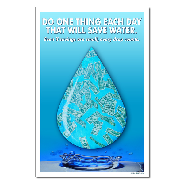
This image uses Gestalt principles of simplicity and proximity to create a pleasing composition that can be easily interpreted by viewers. It makes creative use of negative space.


You must be logged in to post a comment.