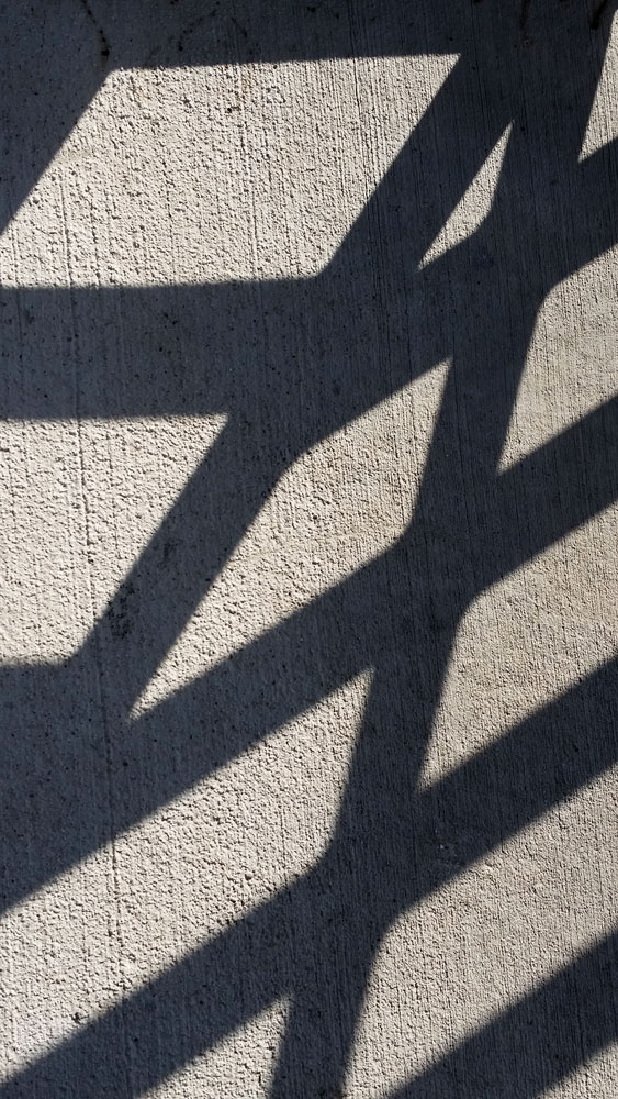
I made this photo because we were asked to find images that utilized line, point and plane. This one jumped out at me because it includes each of these three elements of design, as well as contrast, rhythm and repetition.
The lines of the spokes draw the viewer through the image, while the points add visual interest and provide stopping points for viewer’s eyes to rest. The planes, most visible at the top of the image add depth and interest.
The strong lines create visual impact and attract viewer’s attention. The repeated triangles that result from the convergence of the lines into the largest point in the image create a rhythm. Their repetition, along with the repetition of the lines and points, create a strong rhythm in the image.
Image 2
My phone doesn’t capture high quality images, but I made the photo of this sign in the Tivoli because I liked its design.
The type choices in this image create movement and balance. They work together in a hierarchy to draw the viewer’s eyes through the image. The “Tivoli” text on a line, with the strong, angled line beneath it pointedly takes viewers through the image. The smaller text at the bottom provides information some viewers may want, but it is subordinated to the main info the image seeks to convey.
The image of the mountains behind the text is enough to visually make viewers think of Colorado and clean water (formerly clean). It is light enough and simple enough not to compete with the strong text.
The dark text across the lighter image creates contrast and some tension. The distribution of text throughout the image creates and overall sense of asymmetrical balance.
Image 3
This third image is one I captured with my phone, during our class time. I didn’t know we were to focus on posters, so I made this photo because I was drawn to the line, repetition and contrast.
The lines create a sense of movement from lower left to top right. The repetition in the diagonal, horizontal lines creates a sense of continuity. However, other lines of about the same thickness move through the image and intersect at points that add interest and asymmetry. Overall this image maintains a sense of balance because the parts work together. There is enough similarity to establish unity and enough variation to make it interesting.
The strong contrast in this image is visually arresting and demands viewer’s attention. This strength is softened by the texture in the concrete that viewers who look closely will see is also visible in the deep shadows.


You must be logged in to post a comment.